

Design a User Experience for Social Good & Prepare for Jobs Course Journey Week 3

Table of contents
This is the third article in the series. If you haven't read them, Here are the First Article and Second Article.
In this article, I will talk about the third week of the course. I will create the mockups and the high-fidelity prototype.
Designing Mockups
Now I will work on the visual design.
Typography
I always struggled with selecting the typeface. This time, I decided to use Melon AI to help me decide. I checked out a few articles, saved them in a new collection and I read a little to know the basics and jargon.
When I asked Melon AI for typeface suggestions for a habit App, I got two san serif typefaces but I wanted one serif. I had to google the use of these two typesfaces in existing designs and I love the choices and will use them. So here is what I got from Melon:
If you're looking for a serif typeface for headlines that has a modern twist, I recommend considering Playfair Display. It's a stylish and elegant serif font that combines traditional elements with a contemporary feel. Playfair Display can add a touch of sophistication to your headlines while still maintaining a modern aesthetic. 🌟
For the body text, you can still use Open Sans as mentioned earlier. Its clean and neutral design will provide a nice contrast to the more decorative headlines. This combination will create a visually appealing and balanced look for your habit tracking app. 🎯
Src: Melon AI
Then I wanted to know what to use for cta "call-to-action" buttons, and I got the following response from Melon AI:
For call-to-action (CTA) buttons, you should use a font that is clear, legible, and stands out. In your case, Open Sans would be a great choice. It's a clean and modern sans-serif typeface that is highly legible at both small and large sizes, making it perfect for buttons.
Remember, the goal of a CTA button is to draw attention and prompt the user to take action, so the font should be easy to read and understand. Also, consider using bold or semi-bold weight for added emphasis. 😊
Remember to pair it with a contrasting color to make it stand out even more! 🎨
Src: Melon AI
For the font sizes, I asked Melon AI, of course since its answers are based on the articles I saved in the collections. Here it is:
Choosing the right font size is crucial for readability and overall user experience. Here are some general guidelines based on your Brain:
Headings: These should be the largest text on the screen, typically ranging from 20-34 points. They should grab attention and make it clear what the section is about. 📝
Subheadings: Slightly smaller than headings, usually around 16-20 points. They provide additional context or details. 🗒️
Body Text: This is the main text users will read. It should be easy on the eyes, typically around 14-16 points. 📖
Captions or Notes: These are the smallest text, usually around 12-14 points. They provide extra information but aren't critical to understanding the main content. 🖊️
Remember, these are just starting points. The exact sizes can vary based on the specific font you're using and the overall design of your app. Always test your design with real users to ensure it's readable and comfortable to use. 👀👍
Also, consider using scalable font sizes (like 'em' or 'rem' in CSS) to ensure your text looks good on different screen sizes and resolutions. This is especially important for a mobile app, where users might have a wide range of device sizes. 📱💡😊
Src: Melon AI
Colors
I wanted the app to have colorful and bold colors while at the same time calming. I asked Melon for the best colors for a habit-tracking app. Melon AI responded with either blue or green since they are calming and motivating. I was actually thinking of blue specifically light blue cause I know it is a calming color. But I decided to use green cause green is associated with freshness, growth, positivity and relaxation, it felt like the right base color for my app.
I always use paletton to generate a color palette. Here is my palette:
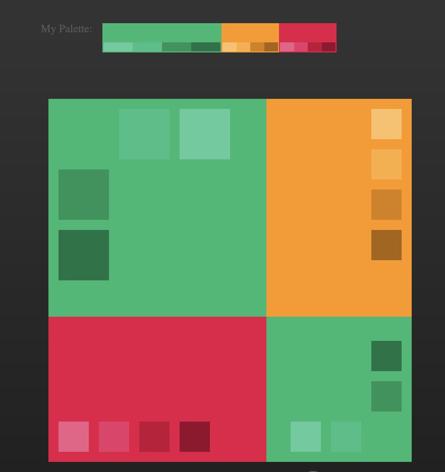
It can totally change while I am designing the app. I normally add lighter shades of the same color as well.
Design system
To create my design system, I decided to use a pre-existed one, Google material design and modify it. I ended up using just a few elements and created the rest. Check the final sticker sheet below. The sticker sheet was created alongside the mockups. So, I normally create the element in its right place in the mockup, make it into a component, drag it to the sticker sheet and then take an instance from the component and use it again in the mockup. I hope that it isn't confusing. Here is the final sticker sheet:

Mockups
Now, Here are the mockups, finally. It took quite some time to fix some issues that were in the wireframes. I checked Dribble and Pinterest for some inspiration. All the illustrations are from storyset, and the icons are from the Figma plugin, Iconify.
Here are the mockups:

You can check the prototype here.

I haven't designed every screen ever for the app, just the main ones and the main flow of adding a habit.
Conclusion
Designing a product shouldn't end with a working prototype, as I said before, always get feedback from users and improve your designs. I didn't test the high-fidelity prototype for time purposes, but we normally should. Feel free to comment below on what you think of the final design and what should be improved.
Thanks for reading! Stay tuned for the week 4 Article where I will be designing a responsive website for the app. It is going to be a landing page for the app with a "functioning in theory" web app so that the users can use the app on their phones and on their desktops.